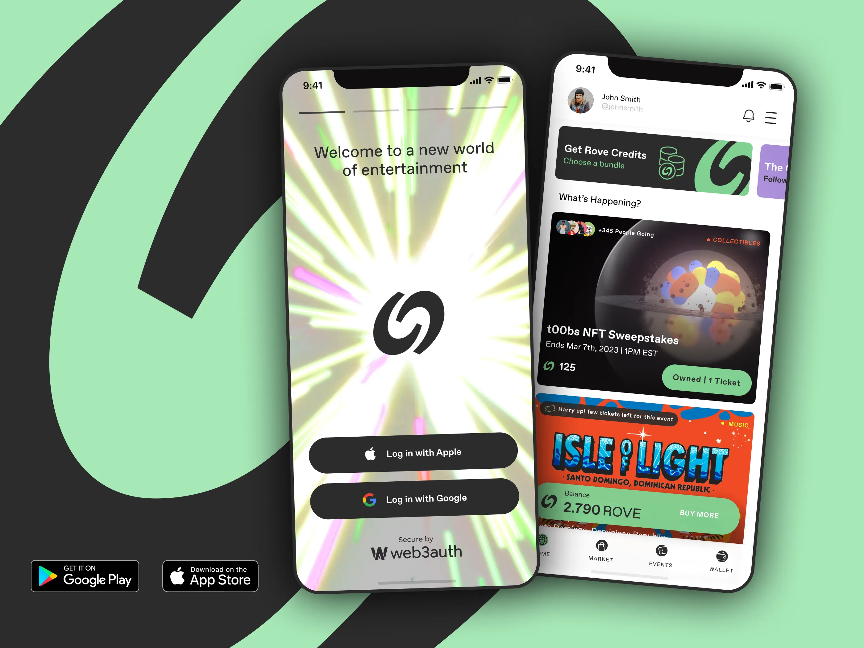
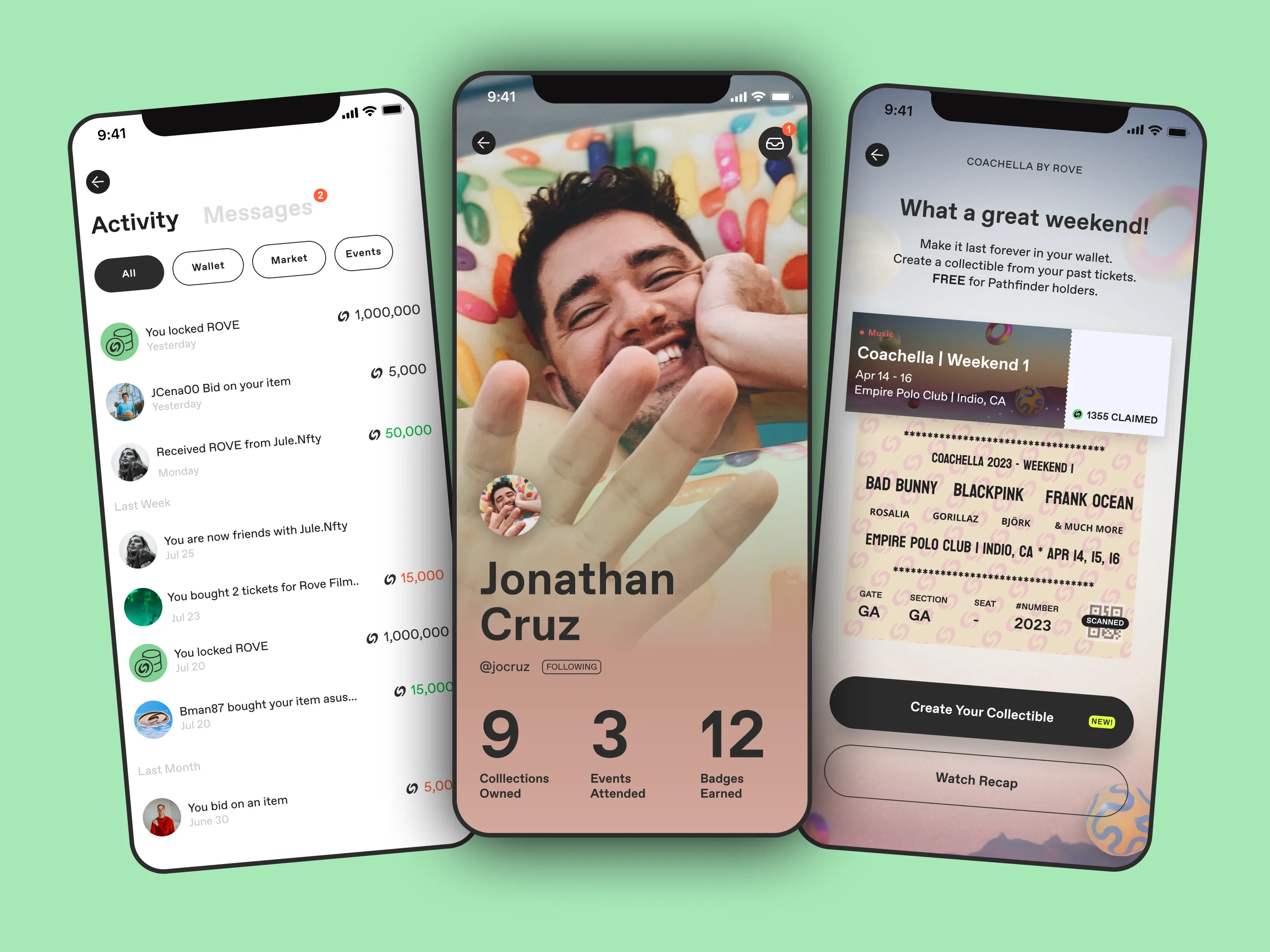
Principal Designer. Currently at DirectWay Health. Previously shipped from zero and scaled under pressure.
Rove started with nothing. No users, no brand, no decision about what the product actually was. I came in from day one — first sketches, elevator pitch, full UI — as the only designer.
The trap with zero-to-one is over-designing for a future you can't predict. Instead of a finished product, I designed a structure: patterns, tokens, and flows that could absorb whatever the product became next. Every screen was treated as a provisional answer, not a final one.
Shipped to the App Store and Google Play. More importantly, the structure held through every pivot after.
“You're not designing a final product. You're designing a structure that can absorb change without collapsing.” — FROM “DESIGNING STRUCTURES THAT ABSORB CHANGE”
Crop Plan served dozens of users, but the business needed thousands. The team kept polishing the UI. The UI was fine. The users were wrong.
The real end-users were older farmers with limited digital familiarity — so brokers were completing the flows for them instead. I rebuilt the product around that reality. Enrollment with no user decisions. Field identification on a map, because maps are concrete and farmers don't need abstractions. Warranty triggers that didn't ask for information the user had already given.
Real adoption went up. Broker dependency went down. The product could finally scale, because it was finally designed for the people actually using it.
Ownership changed. The company was growing fast. I was brought in to help evolve the product through a complete rebrand and relaunch — on a compressed timeline, across a live platform with 200,000+ registered users and real payouts flowing.
The instinct in those moments is to freeze: don't touch what works. I pushed the other way. Onboarding friction was costing us the growth we'd just paid for, and the design system had drifted. I rebuilt onboarding around fewer decisions and faster first moments, and cleaned up the system enough to ship consistently under the new brand.
High-velocity work where structure is the difference between moving fast and breaking things. The platform kept scaling through the transition.
“Constraints aren't the enemy of craft. They're the shape of it.” — FROM “DESIGNING INSIDE HARD LINES”
Dynamic ads that reacted to the user's local weather in real time. Rain outside, one message. Hot day, another. Designed to drive purchases without the user ever opening the app.
The interesting constraint wasn't the weather logic — it was Amazon's brand guidelines. Rigid. Non-negotiable. Every asset defined to the pixel. The creative work lived inside that box, which meant the craft had to come from precision: clean motion, consistent hierarchy across every ad size, quality that held up at scale.
Technical discipline and professional execution. That's the whole point of this one.
A proposal to GoneStreakin' for an NFT marketplace built around fantasy sports. I led the full pitch: brand identity, website, app dashboard, and the video you saw earlier up-page.
What I'm showing in this portfolio isn't the shipped product — it's the work of making a convincing argument. Identity that holds up at scale. Dashboards that feel inevitable. A pitch designed to make the opportunity obvious.
Closing this reel here because it's a different mode: less about survival, more about the persuasion work that gets projects funded in the first place.